
Misty Mountain – Hospitality Branding
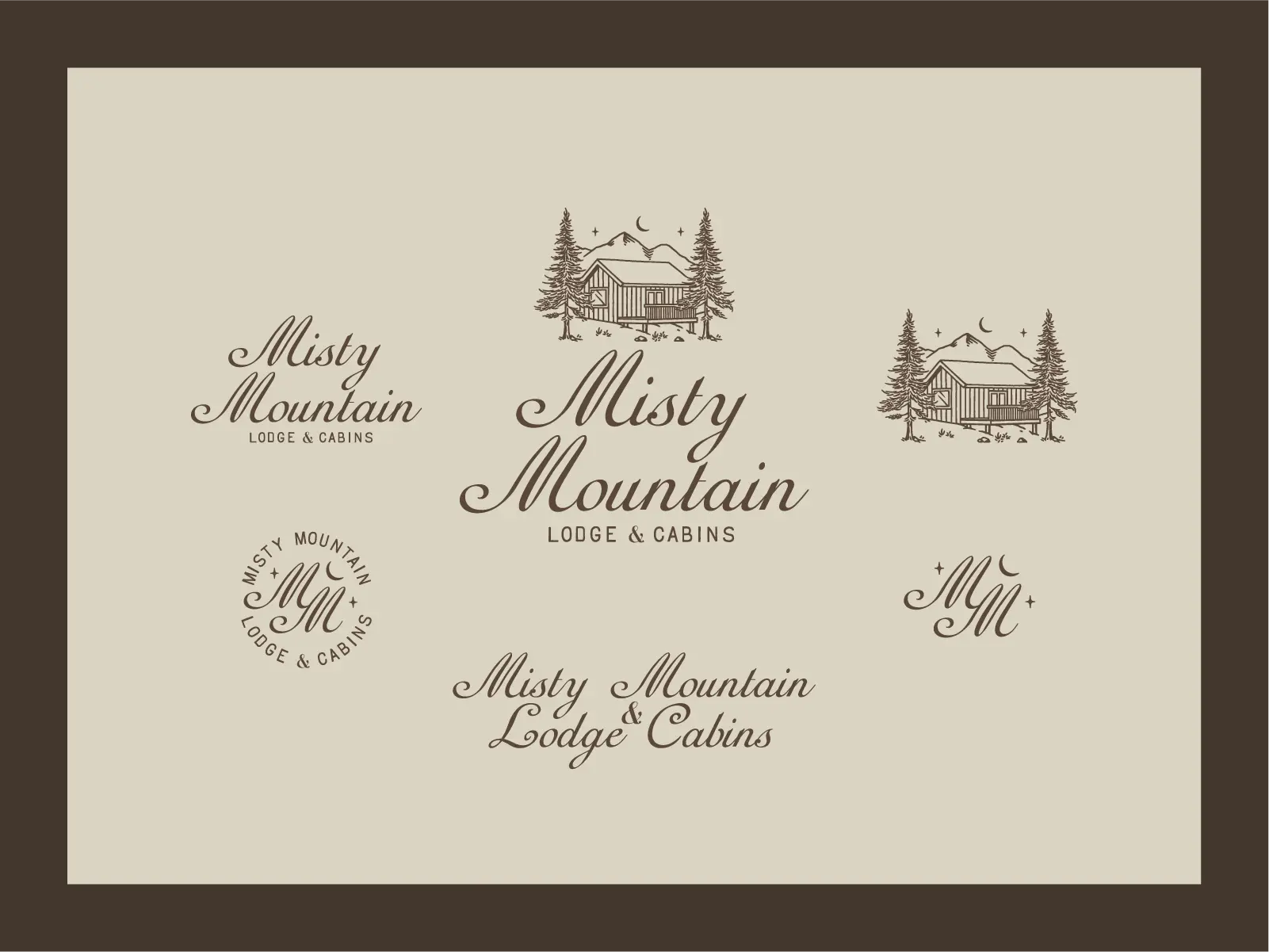
Tucked away in the mountains of North Georgia, Misty Mountain Lodge & Cabins is the kind of place where slow mornings, wooded trails, and evenings by the fire are part of the experience.
We designed an identity that feels right at home in that setting. Hand-drawn cabin illustrations, pine trees, and a crescent moon meet elegant script lettering and a warm, earthy color palette. There’s a touch of vintage mountain lodging nostalgia throughout, from the old-school room key tags and matchboxes to the signage, stationery, and merchandise.
The identity also carries into social media and website layouts, bringing the same cozy, lived-in character across every touchpoint. Nothing overly fancy, just a brand that feels like a place you’d want to stay a few extra nights.
Bigfoot Kick – Apparel Graphic Design
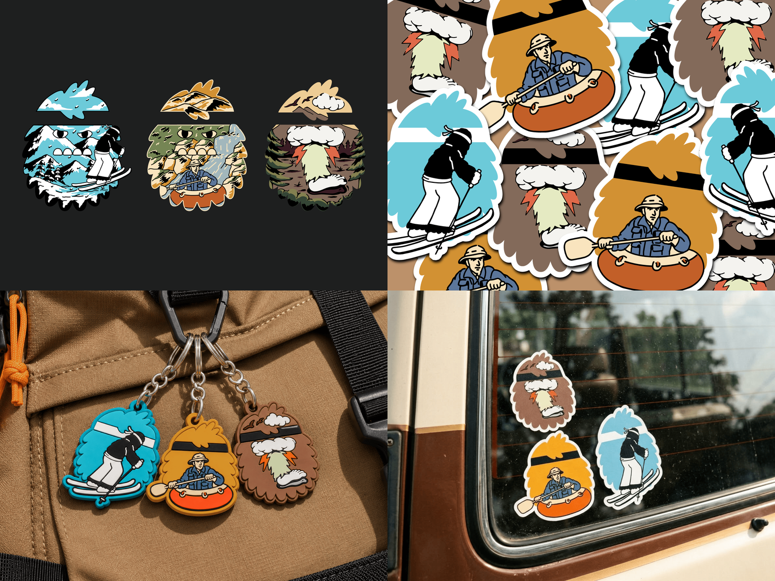
The outdoors has its own kind of weird, and Bigfoot Kick embracing it
We created a series of three custom illustrations inspired by the adventures that take us outside: wandering through the woods, skiing down snowy mountains, and rafting through wild rivers. Each design hides a landscape inside a playful, shaggy Bigfoot-shaped silhouette, with chunky outlines, retro colors, and plenty of character
Unbridled Ventures – Brand Identity Design
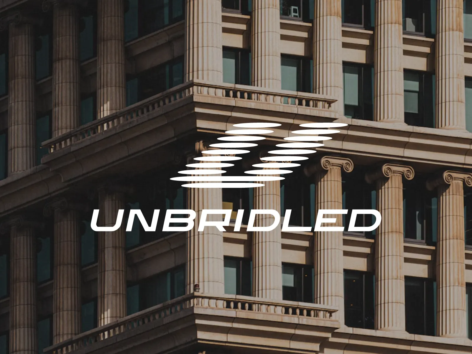
A holding company focused on business acquisitions and real estate investments, driven by a belief that potential has no fixed limits.
The identity takes inspiration from speed, freedom, and the feeling of pushing beyond the horizon. An aerodynamic symbol and forward-leaning wordmark capture that sense of constant motion, while the clean, deliberate execution reflects the discipline behind every ambitious move.
It’s a visual expression of what Unbridled stands for: seeing untapped potential in existing businesses and properties, then having the vision and drive to take them somewhere bigger.
Samesun Hostel – Merchandise
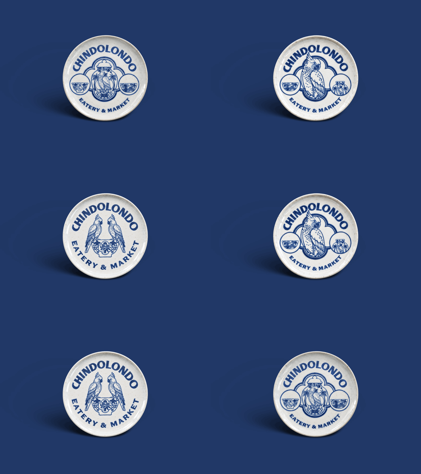
CHINDOLONDO – Restaurant Branding
Joud Coffee – Branding & Packaging
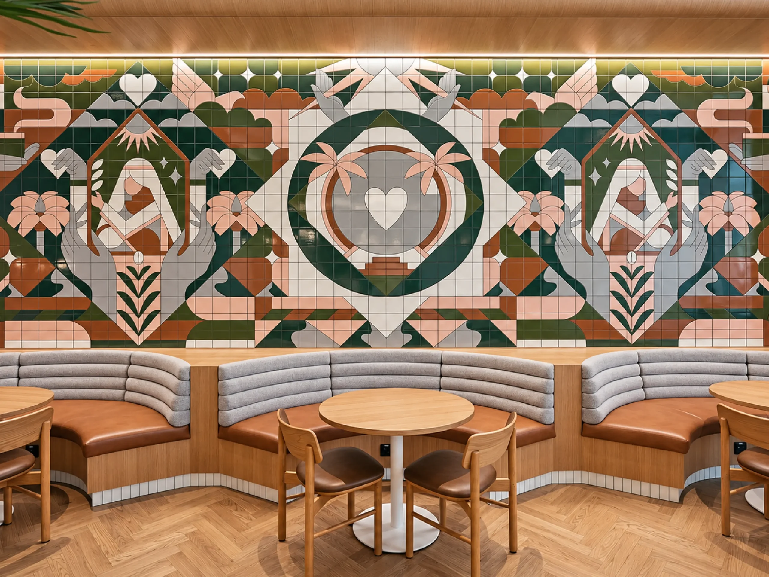
A complete visual identity and packaging system for Joud Coffee, bringing the brand across coffee shops, apparel, merchandise, packaging, cups, and retail applications. The system balances earthy tones, illustrative graphics, and bold coffee culture references for a cohesive and approachable brand experience.
The identity expands across environmental graphics, signage, business collateral, editorial materials, office essentials, merchandise, social media, and web applications. A refined palette of deep green, navy, and neutral tones keeps the system professional and cohesive, while bold typography and structured layouts give the brand a contemporary edge.
From storefront applications and presentation folders to digital campaigns, publications, and wearable details, every touchpoint was designed to feel confident, consistent, and built for firms ready to grow beyond the practice.
Bonjud Orthopedic Pet – Mascot Branding
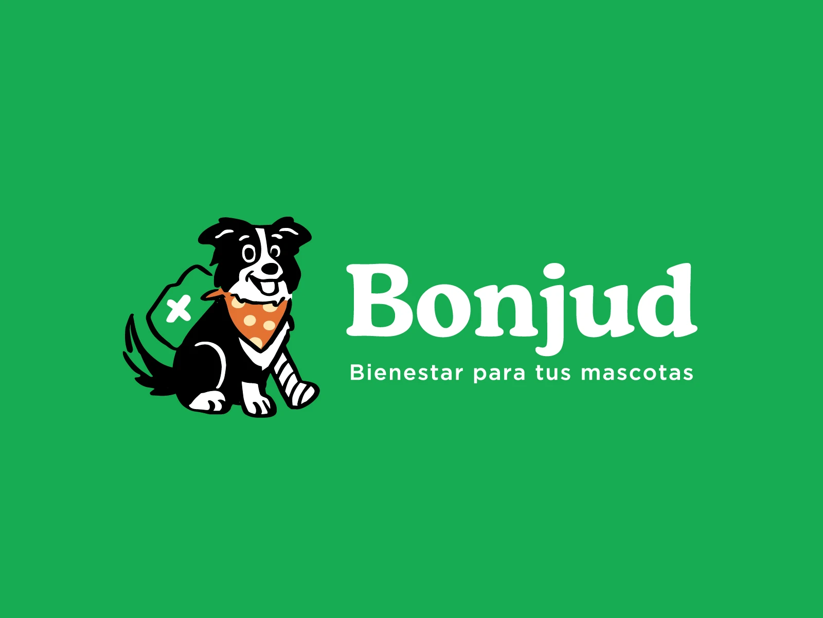
a compassionate brand dedicated to enhancing the quality of life for adult dogs and pets with medical conditions. Through thoughtful branding, mascot design, and applications across packaging, advertising, and social media, Bonjud embodies comfort, mobility, and care, helping every pet move and heal with confidence
The identity expands across environmental graphics, signage, business collateral, editorial materials, office essentials, merchandise, social media, and web applications. A refined palette of deep green, navy, and neutral tones keeps the system professional and cohesive, while bold typography and structured layouts give the brand a contemporary edge.
From storefront applications and presentation folders to digital campaigns, publications, and wearable details, every touchpoint was designed to feel confident, consistent, and built for firms ready to grow beyond the practice.
Build Your Firm – Brand Identity Design
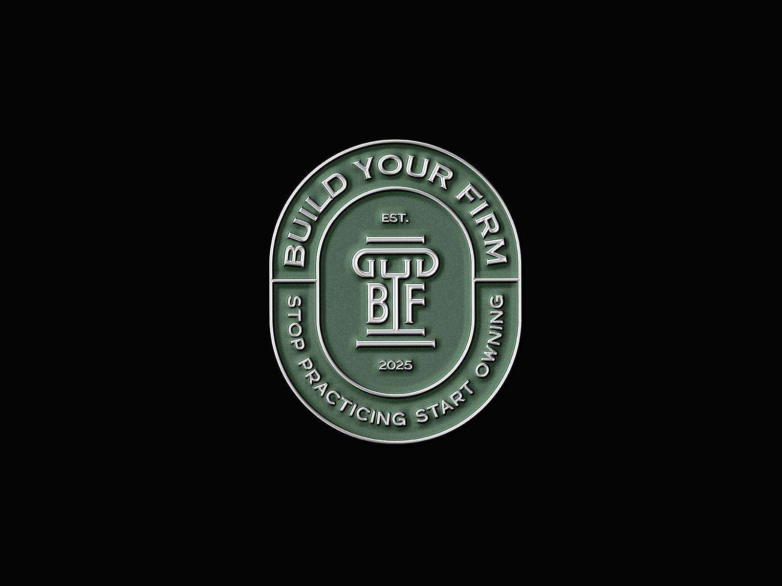
Build Your Firm is a legal-focused brand identity built around structure, ownership, and long-term growth. The visual system is centered on a custom B/F monogram inspired by classical architectural columns, creating a strong connection to stability, trust, and professional authority.
The identity expands across environmental graphics, signage, business collateral, editorial materials, office essentials, merchandise, social media, and web applications. A refined palette of deep green, navy, and neutral tones keeps the system professional and cohesive, while bold typography and structured layouts give the brand a contemporary edge.
From storefront applications and presentation folders to digital campaigns, publications, and wearable details, every touchpoint was designed to feel confident, consistent, and built for firms ready to grow beyond the practice.
Otium – Literary Brand Identity Design
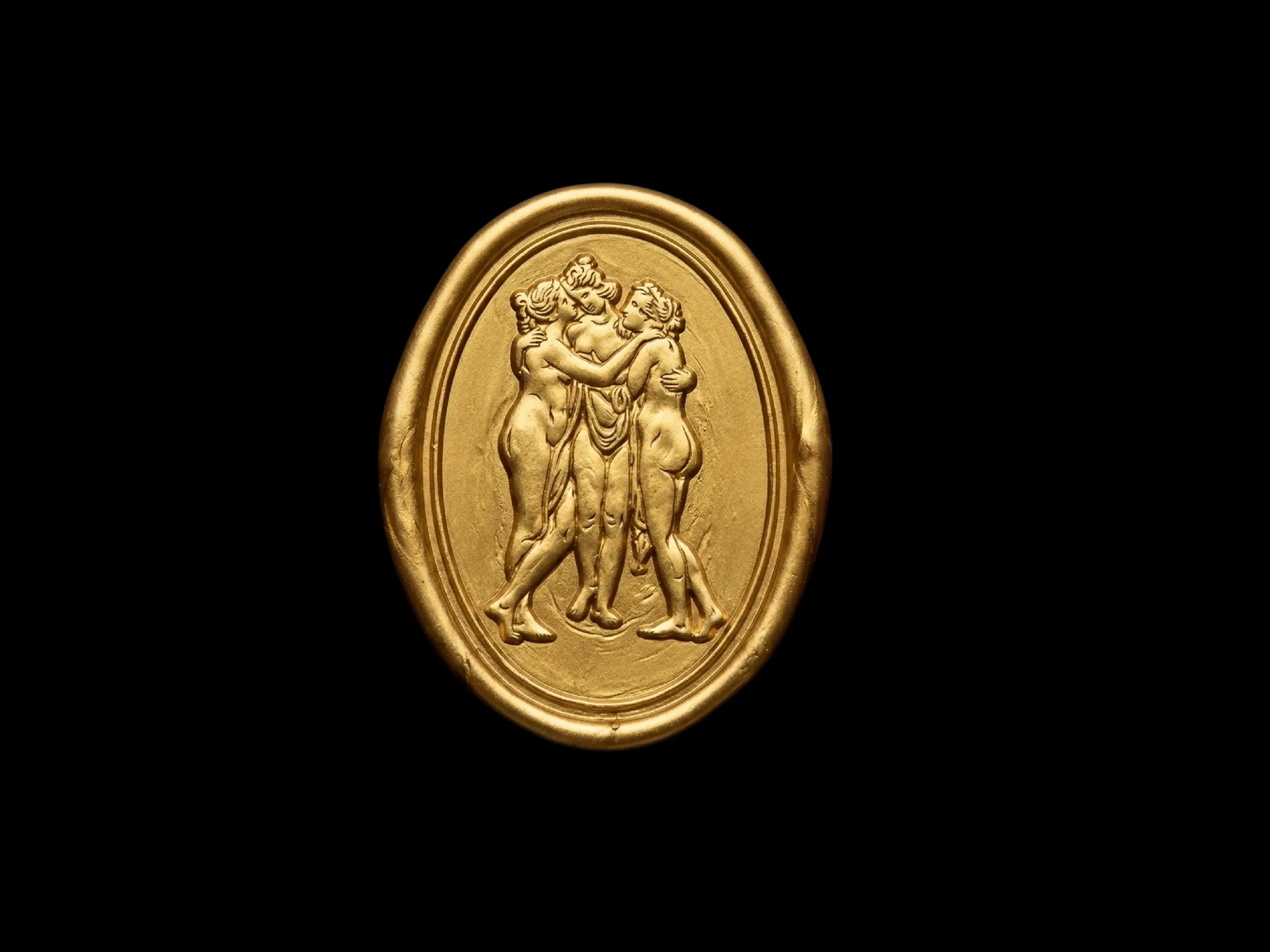
Otium is a visual identity created for a Substack publication and Instagram platform exploring slow media, creative leisure, and thoughtful living. The system draws from classical art, refined serif typography, and restrained editorial layouts to create a visual language that feels reflective, cultural, and quietly distinctive. The identity extends across logo exploration, emblem design, merchandise, collateral, web, and social media, using a minimal palette of black, cream, yellow, and gold to maintain consistency across every touchpoint.
Bomba Coffee Roasters – Coffee Branding

We had a lot of fun bringing the energy of California into the identity for Bomba Coffee Roasters. The goal was to create something bold, sunny, and approachable while still feeling rooted in specialty coffee. I built the visual system around a punchy orange-and-cream palette, paired with bold, clean typography that keeps everything feeling modern and easy to connect with.
At the heart of the brand is a playful custom mascot that adds personality and a little bit of character to every touchpoint. From menus and cup carriers to takeaway packaging, storefront signage, and social media, the identity was designed to feel consistent without ever feeling repetitive.
The result is a bright, flexible brand system that feels as energetic as Bomba itself, and hopefully makes discovering great coffee feel a little more fun.